Hi friend! If you're here, you're a creative, entrepreneur, or business owner looking to build a stronger online presence. Welcome, you're in the right place!
I share everything I know about website design and digital marketing, covering both service-based businesses and e-commerce brands.
My sweet spot is blending intentional visual design with clear, compelling content to create websites that do more than look good. They build trust, attract the right people, and turn visitors into clients and customers.
Ready to collaborate? Contact me to schedule a free 30-minute call.
Janelle Cassiano
What I Look at First When I Audit a Client’s Website
Read time: 9 minutes | A beautiful website is only effective when it clearly communicates your value, builds trust, and guides visitors toward the next step. I’m sharing the key areas I review, including messaging, visual hierarchy, navigation, mobile design, calls to action, brand consistency, trust signals, and technical performance.
A website audit is one of the first steps I take when learning about a business.
Before recommending design changes or having a conversation with a business owner, I take time to understand how their website currently represents the business, where it may be creating confusion, and which improvements could help connect more clearly with potenial clients and customers.
Most often, when a new webiste visitor lands on a homepage, they do not know the name or story behind the brand yet. They do not know much about the business owner, how valuable the service might be or if they will love the products offered. The website needs to communicate those things clearly and quickly.
A website audit helps identify what is already working, what may be creating confusion, and where valuable opportunities are being missed. It gives me a clearer picture, as both a website designer and propective buyer of how the messaging, design, navigation, and overall customer experience work together. Sometimes a website does not need a complete redesign. It may simply need stronger copy, clearer calls to action, improved mobile layouts, or more trust-building information. By reviewing each of these areas, I can recommend changes based on what will best support the business, it’s clients and/or customers, rather than suggesting updates based only on appearance.
In this post, I’m sharing what I look at when I audit a website. You can also use this same process to take a more objective look at your own site.
Btw; I use a version of this checklist when responding to a new inquiry or when I come across a company whose story, services, or brand I feel connected to and want to reach out to.
1. The First Five Seconds: The Gut Check
I begin by opening the website and taking in the first impression.
Does the website feel like an independant, established brand, or could it belong to almost any business? Is it immediately clear what the company does, who it serves, and what makes it different?
Visitors should not have to scroll through several sections or study the copy to understand the offer. If the main message is unclear, even a beautiful website can lose the right customer.
During those first few seconds, I look for:
- A clear, stong hero section above the fold
- A short explanation of the service or product
- A visual style that supports the brand
- An obvious next step
- A reason for the visitor to continue
The goal is not to explain everything at once. It is to give a visitor enough clarity and interest to stay.
2. The Messaging and Clarity Check
Next, I review the words. The subtitles, headers and copy.
Does the website speak directly to the right customer or client? Does it explain the problem the business solves, the services it provides, and the value of the product(s) or why they should work with that company?
One of the most common website issues I see is copy that focuses heavily on the business but does not connect those details to what the potential visitor needs.
Visitors are usually asking themselves:
- Is this what I’m looking for?
- Does this business understand what I need?
- Can I trust them to help me?
- What will it be like to work with them?
- Is this business trustworthy to buy from?
- What should I do next?
Strong website copy answers those questions naturally. It does not need to feel pushy or overly polished. It should sound clear, thoughtful, and true to the brand.
I also look for missing information. Unanswered questions often become reasons for a potential customer to leave without reaching out.
3. Where My Eyes Go Next: Visual Hierarchy
Once the first impression settles, I pay attention to where my eyes naturally travel.
Is there a clear journey from the headline to the supporting copy, images, service information, and next step? Or is every element competing for attention?
Good visual hierarchy helps visitors understand what matters as they scroll the website, without having to think about it. Headlines should introduce the main idea, supporting copy adds helpful details, and buttons guide the visitor forward.
When every element is the same size, weight, or level of importance, nothing stands out. The page may look busy, even when it does not contain much information.
I look at:
- Heading sizes
- Paragraph length
- White space
- Section separation
- Button placement
- Image positioning
- Contrast and readability
A well-organized page should feel easy to follow from beginning to end.
4. The Navigation Test
Next, I use the main and footer navigation menus as a potential customer would.
I choose something specific to find, such as services, pricing, examples of past work, frequently asked questions, or contact information.
Can I find it in two clicks or fewer? Are the page names clear? Does the menu contain too many options?
If visitors have to hunt for basic information, they may assume the process of working with the business will feel equally complicated.
A strong navigation menu does not need to include every page on the website. It should prioritize the pages that matter most to the customer journey. Secondary information can be placed in a dropdown menu or the footer.
5. The Mobile Experience
I review the desktop and mobile versions separately, with special attention given to mobile.
For many businesses, a large portion of website traffic is on mobile phones. When website analytics are available, I also review which devices visitors are actually using so my recommendations are based on real customer behavior.
On mobile, I look for:
- Text that is too small or difficult to read
- Headlines that wrap awkwardly
- Buttons that are difficult to tap
- Images that crop incorrectly
- Sections with cramped or inconsistent spacing
- Menus that are difficult to navigate
- Forms that are frustrating to complete
- Content that overflows or gets cut off
A website that looks polished on a desktop but is not readable or functional on a phone is not finished and is a big red flag. The mobile site should feel easy to use, still have a balance of visuals and copy that is not simply compressed to fit a smaller screen.
6. The Call-to-Action Audit
Every page should help the visitor understand what to do next.
I review a website’s calls-to-action and pay attention to both the wording and placement. Is there one clear next step, or are several buttons competing for attention?
The right call to action depends on where the visitor is in the decision-making process. Someone visiting a homepage for the first time may want to explore services or view past work. Someone reading a service page may be ready to inquire or schedule a consultation.
The best calls to action appear when the visitor has enough information to make a decision. They should not be limited to one button at the bottom of a long page.
7. Brand Consistency
Next, I look across every page to see if the website feels cohesive.
Are the fonts, colors, photography, buttons, and layouts consistent? Does the voice of the copy remain recognizable throughout the website?
Websites naturally change over time. A new page gets added, a promotion creates another banner, or several people make updates with different design styles. Little by little, the site can begin to feel like it was forgotten or a hodgepodge of the brand.
Consistency does not mean every page needs to look exactly the same. It means the pages should clearly belong to the same business.
A consistent website feels professional and easier to trust.
8. The Trust Check
Before someone reaches out, they are usually looking for reassurance that they are in capable hands.
I check whether the website includes enough trust-building information to help a potential customer feel confident taking the next step.
Depending on the business, that might include:
- Client testimonials
- Portfolio examples
- Product descriptions
- Store policies
- Case studies
- Professional experience
- Credentials or certifications
- Frequently asked questions
- Clear service details
- A personalized About page
- Recognizable clients, partners, or publications
- Easy-to-find contact information
These elements should support the claims being made throughout the website. Telling visitors that you provide excellent products or services is helpful. And if you’re like me, being able to read reviews from past clients and customers and what they have experienced is one of the best way to build trust.
9. Load Time, Accessibility, and Technical Basics
Finally, I review the less glamorous details that still have a major effect on the visitor’s experience.
I check for:
- Slow-loading pages
- Oversized image files
- Broken links
- Missing images
- Forms that do not submit correctly
- Outdated information
- Poor color contrast
- Missing image alt text
- Incorrect heading structure
- Missing page titles and meta descriptions
- Layout problems on different screen sizes
A visitor may never tell you that a page loaded too slowly or a button did not work. They may simply leave.
None of the design work matters if the website is difficult to use or quietly broken in places. These technical details may not be exciting, but they are an important part of building a website that feels professional and dependable.
What This Means for Your Website
You do not need to be a professional website designer to catch some of these issues yourself.
Open your website on both your computer and phone, then review:
- First impression
- Messaging
- Visual hierarchy
- Navigation
- Mobile experience
- Calls to action
- Brand consistency
- Trust signals
- Technical performance
Try to view the website as someone who has never heard of your business before. What would they understand immediately? What questions would they still have? Would they know what to do next?
Chances are, one or two areas will stand out. No website is ever done, so you will find things that need attention as your business has evolved.
And keep in mind, most websites are not failing everywhere. More often, they have a few important gaps that create confusion, weaken trust, or make it harder for visitors to take the next step.
An extensive website audit helps uncover all the gaps before you invest time and money. It gives you a clear understanding of what should be improved, what should stay, and which updates could make the greatest difference.
Related Post: The Best Communicator Always Wins: Why Your Product or Service Does Not Sell Itself
Ready for a Second Pair of Eyes?
If your website has a strong foundation but something still feels off, book a professional website audit. I’ll help you identify the areas creating confusion and the changes that will improve the visitor experience, strengthen trust, and make it easier for the right customers to reach out.
If your a service-based business and your website has outgrown its current design and you are ready for a fresh start, browse the Showit template shop to find a strategic, thoughtfully designed template foundation for your business.
If your an e-commerce business and you’ve outgrown your current theme and you are ready for a new theme, browse the Shopify theme store.
Your website will benefit from an audit if it’s been a while since you’ve updated or launched your website, receives traffic but few sales or inquiries, feels difficult to navigate, or no longer reflects your business. An audit can also be helpful before a redesign because it identifies what is working, what needs improvement.
Yes. An audit can definitely help determine which problems are related to the visual design and which ones come from the messaging, structure, or customer journey. This prevents you from making changes that aren’t needed while overlooking big gaps.
Yes. A website can be visually beautiful but still create confusion through unclear messaging, weak calls to action, missing information, or a complicated navigation menu. Good design should do more than look polished. It should help the right visitors understand your value, trust your business, and take the next step.
When you work closely with your business, you already understand your services, processes, and terminology. This makes it harder to notice missing information or confusing details. An audit by a website designer will provide an outside perspective and identify areas you may be too familiar with to see clearly.

I’m the designer behind Curated Coastal Lounge, a website design studio based in New Smyrna Beach, FL. I offers strategic Showit website templates and semi-custom website design services on the Showit and Shopify platforms.
I work with creatives and purpose-driven businesses, with a focus on health and wellness practices, equestrian businesses, ranches, and agricultural brands. If you are a business that is ready for a website that feels personal, looks polished, and is built to grow, schedule a call.
My clients come to me when they want more than a pretty website. They want something that translates their story through clear visual design and strong messaging into a site that earns trust, drives bookings, and converts the right buyers.
Schedule a Free Discovery Call: Casual, no obligation. I’m happy to brainstorm your options with you.
FAVORITE COFFEE:
white chocolate mocha
currently reading:
Green Lights
Mathew McConaughey
Favorite Local grub:
Rudy's el pastor
street tacos
Current Affirmation:
"Your talent is God's gift to you. What you do with it is your gift back to God."
Fun Facts
Leave a Reply
You may also like...
What I Look at First When I Audit a Client’s Website
Read time: 9 minutes | A beautiful website is only effective when it clearly communicates your value, builds trust, and guides visitors toward the next step. I’m sharing the key areas I review, including messaging, visual hierarchy, navigation, mobile design, calls to action, brand consistency, trust signals, and technical performance. A website audit is one […]
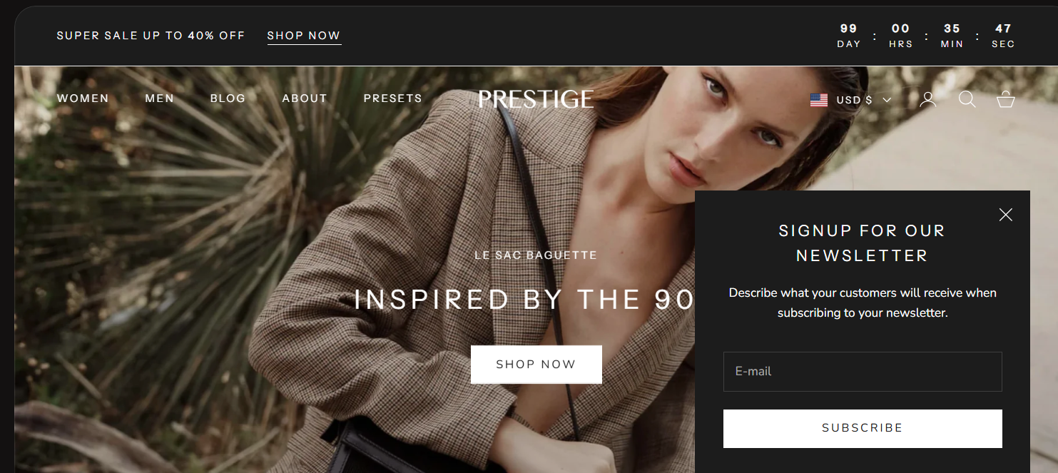
Read time: 11 minutes | If you’ve been exploring Shopify themes and Prestige has caught your attention, you’re looking at one of the platform’s most polished options. Created by Maestrooo and priced at $400, Prestige combines elegant design with powerful selling features, making it especially well-suited for premium and luxury brands. What Is the Prestige […]
Prestige Shopify Theme Review for High-End and Luxury Brands: Vogue vs. Strass
Free Shopify Website Themes vs. Premium Shopify Themes: How to Know When It’s Time to Upgrade
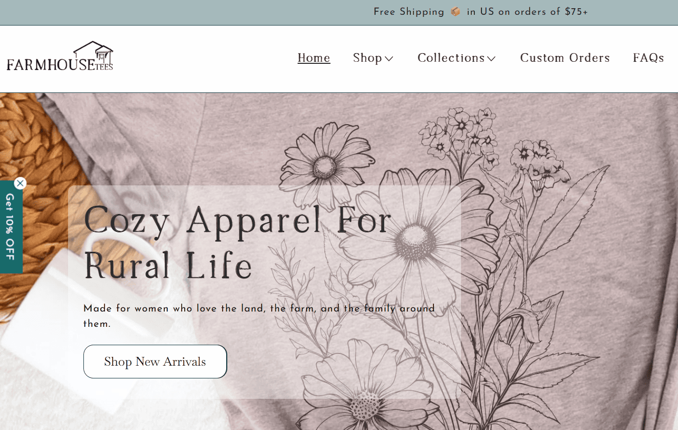
Read time: 12 minutes | Starting with a free website theme is a smart choice for many new businesses, but what happens when your business begins to outgrow it? In this post, I’ll talk about free themes and premium website themes, look at a real before-and-after transformation, and walk through the signs that it may […]
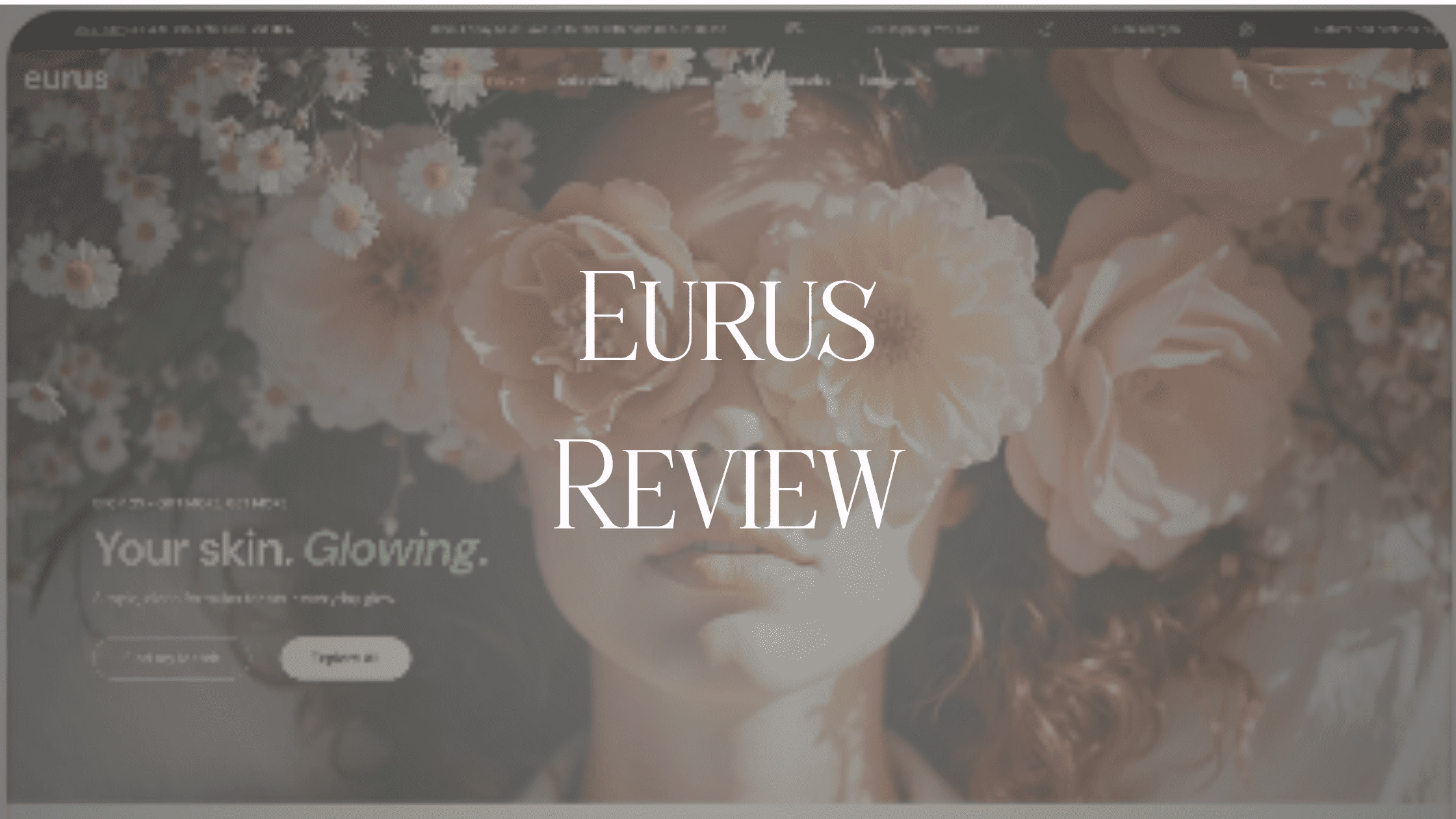
Eurus Shopify Theme Review: Hue vs Breeze Preset designs
Read time: 12 min read | If you’ve been researching Shopify themes and landed on Eurus, you’re already looking in the right direction. Built by BSS Commerce and priced at $350, Eurus is one of the most feature-rich, conversion-focused themes on the Shopify Theme Store. One Theme, Two Personalities: Hue vs. Breeze This review focuses […]
Read Time: 5 minutes | This post makes the case for email marketing as a non-negotiable business tool for both e-commerce and service-based brands. Supporting data from the 2026 Omnisend e-commerce Marketing Report is woven in as evidence. The post also includes an email platform comparison and also speaks directly to service-based businesses. Email marketing […]
Email Marketing for E-Commerce: The ROI Stats That Will Surprise You

Visual Perception: What Your Website Is Communicating Before You Say a Word
Read time: 7 minutes | Most businesses focus on what their website says. The more important question is what it communicates before anyone starts reading. Learn how the visual experience of your site shapes trust, credibility, and whether a potential client decides to stay or move on. Every Visual Choice on Your Website Sends a […]

The Best Communicator Always Wins: Why Your Product or Service Does Not Sell Itself
Read time: 5 minutes | This post challenges the common belief that a great product or service sells itself. Using the lens of perception design, hear why the best communicator always wins in today’s online marketplace and what that means for all businesses, including health and wellness practitioners, equestrian and ranch businesses, and product-based brands. […]
Read time: 5 minutes | Professionally designed website templates are one of the smartest investments a small business owner can make. Start with a strong foundation that was built by someone who already figured out the layout, the flow, the placement of testimonials, and the calls to action that actually convert. Preview three niche Curated […]
Showit’s Best-Kept Secret to Looking Pro Online: + 3 Niche Website Templates


5 Showit Website Templates: Built for Health & Wellness Practitioners
Read time: 6 minutes | In wellness, your website actually affects how someone feels while they’re on your site. A breakdown of the five Showit website templates for health coaches, nutritionists, chiropractors, functional medicine providers, and holistic practitioners. What to Look for in a Health & Wellness Website Template Before diving into the templates, it’s […]
Disclosure: This page may contain affiliate links and I may receive a small commissions from purchases made through links at no additional cost to you. I only recommend products I would use myself and all opinions expressed here are our own.

Visual + Content
Your website should create that essential "pause-and-engage" impact on visitors, encouraging them to browse all of your pages.
