Hi friend! If you're here, you're a creative, entrepreneur, or business owner looking to build a stronger online presence. Welcome, you're in the right place!
I share everything I know about website design and digital marketing, covering both service-based businesses and e-commerce brands.
My sweet spot is blending intentional visual design with clear, compelling content to create websites that do more than look good. They build trust, attract the right people, and turn visitors into clients and customers.
Ready to collaborate? Contact me to schedule a free 30-minute call.
Janelle Cassiano
Free Shopify Website Themes vs. Premium Shopify Themes: How to Know When It’s Time to Upgrade
Read time: 12 minutes | Starting with a free website theme is a smart choice for many new businesses, but what happens when your business begins to outgrow it? In this post, I’ll talk about free themes and premium website themes, look at a real before-and-after transformation, and walk through the signs that it may be time to upgrade. You’ll also learn what to look for in a premium theme so you can choose a website that supports where your business is headed next.
If you started your website with a free theme, you’re in good company.
Most business owners started there. And it often makes sense.
When you’re getting a business off the ground, you need somewhere to send people. You need your products, services, contact information, and story online without spending months or thousands of dollars building the perfect website.
At the beginning stage, good enough to launch is often exactly the right call.
But businesses don’t stay in that stage forever.
Your products evolve. Your services become more focused. Your branding gets stronger. You understand your customers better. Maybe you’ve invested in photography, built a loyal following, or finally figured out exactly what makes your business different.
Eventually, the website that helped you get started is not the website that can best support you or help you get where you’re going.
So how do you know when you’ve reached that point?
I’ve put together a breakdown of what to consider and to help clarify what actually changes when you move from a free Shopify theme to a premium theme. I’ll use a real transformation from Farmhouse Tees to show you.
Free Themes Are Built to Help You Start
Free themes aren’t a wrong choice. They serve an important purpose.
They’re designed to work for a lot of different businesses: a bakery, a farm, a wellness practice, an apparel shop, a photographer, and plenty of others using the same basic starting point.
That flexibility is what makes them useful when you’re starting out.
It’s also what can eventually make them feel limiting.
A free theme gives you the pieces, but you’re usually responsible for figuring out how those pieces should work together for your particular business.
- What should someone see first.
- How to highlight products or services so they are easy to view, feature and buy.
- How do you move someone naturally from “I’m just looking” to “I want to buy this” or “I want to work with them”.
Those decisions involve visual hierarchy, customer experience, messaging, and conversion strategy. Most business owners didn’t exactly sign up to become experts in all of those things when they decided to start a business.
So you can end up with a website that’s technically done, but isn’t doing as much for your business as it could.
So, What Changes With a Premium Theme?
A premium theme isn’t valuable simply because it looks prettier.
You’re paying for more of the strategic thinking to be done, additional sections, and functionality for selling.
A thoughtfully designed template gives you a strategic framework: intentional page flow, visual hierarchy, space for social proof, clear calls-to-action, mobile layouts, and sections designed around the information customers need before they’re ready to take the next step.
But even so, a theme is the foundation; you still have to make it yours.
Your photography, copy, brand colors, offers, customer journey, and personality are what turn a theme into your website.
Think of it like building a house.
A free theme gives you the basic materials and says, “Here’s what you have to work with.”
A well-designed premium theme gives you extra materials and the blueprint.
You still choose the finishes and make the house feel like home, but you’ve got more to work with and your customers will appreciate a well-functioning site. One that they will remember and often find it easier to become ongoing customers.
A Real Before + After: Farmhouse Tees
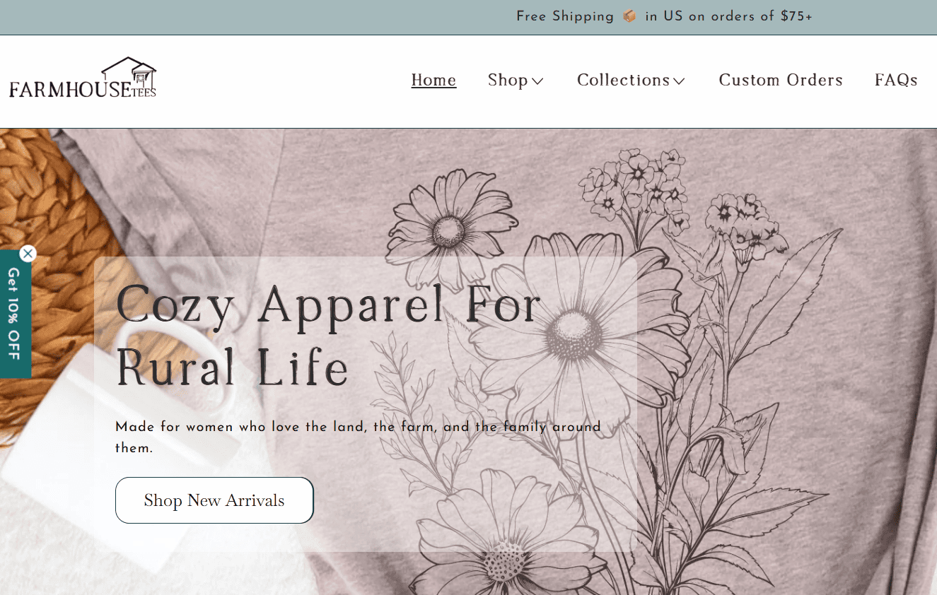
Farmhouse Tees is a product-based apparel brand with a cozy, farmhouse-meets-modern aesthetic. Think soft graphic tees, rustic branding, and a loyal following that loves the vibe as much as the products.
Their original website offered all their products. What it lacked was structure and visuals that brought those ingredients together.
Before: The Free Dawn Theme
The original Farmhouse Tees website included:
- A generic homepage banner that could have belonged to almost any apparel store
- Minimal product information so the customer was left with questions
- No strategic flow that moved customers through the website
- A navigation menu with too many choices
- Products appearing before visitors had much opportunity to understand the story behind the brand
- Missing information about their custom orders and fundraising opportunities
It wasn’t a bad website.
It was doing what it had originally been built to do: getting the business online and giving customers a place to shop.
But Farmhouse Tees had grown beyond that.
The brand has personality and a clear customer base. The products had a recognizable aesthetic. There was a story worth telling.
The website just wasn’t communicating all those things yet.
Screenshot of the original Farmhouse Tees homepage using the free Dawn website theme, showing the homepage.

The Difference After: A Curated Sandra Theme
When I moved Farmhouse Tees to a premium theme, the goal wasn’t simply to make the website prettier.
The goal was to make the website highlight the products and make it easier for the ag community to shop for apparel that speaks to them.
The homepage introduces the brand before asking for the sale.
Instead of immediately selling to visitors, the new homepage establishes the Farmhouse Tees personality through visuals and messaging.
That matters because new visitors get context before they’re asked to shop. They’re not just looking at another graphic tee. They begin to understand the brand behind it.
Typography and color support the personality.
We adjusted the branding slightly with font updates and a warm, muted color palette reinforcing the farmhouse-meets-modern aesthetic.
These may sound like small design choices, but together they help create consistency. Someone moving from Instagram to the website should feel like they’re interacting with the same brand.
Every section has a job.
The new homepage doesn’t include sections simply because there was room for them.
The flow is intentional: introduce the brand, showcase products, build trust, and guide the visitor.
Instead of leaving customers to figure out what to do next, the layout helps lead.
Photography finally gets room to work.
The product photography didn’t suddenly become better.
The design around it did.
By removing competing visual elements and creating more breathing room, the products become the focal point. That’s especially important for product-based businesses where photography is doing a lot of the selling.
Navigation becomes simpler.
More menu options don’t necessarily make a website more useful.
By streamlining the navigation around what customers actually need, visitors have fewer decisions to make and a clearer path toward the products and information they’re looking for.
Updated Farmhouse Tees homepage using a premium theme with simplified navigation, brand-focused imagery, intentional typography, and product sections. To view the rest of the website, visit www.farmhousetees.com

Side-by-Side: What Actually Changed?
| Element | Free Theme | Curated Template | Why It Matters |
| Homepage | Generic banner + product grid | Long homepage with a mix of products, brand story, followed by FAQs | Highlights the brand and products while giving visitors an understanding of the brand before they’re asked to buy |
| Typography | Custom font and theme defaults | Custom font + new fonts selected for the brand personality and readability | Creates a more consistent, recognizable experience |
| Layout | Sections without a clear flow | Intentional visual hierarchy | Guides visitors toward the next step |
| Photography | Competes with other elements | Given space to shine | Keeps attention on the products |
| Navigation | Too many choices | Streamlined path | Makes it easier for customers to find what they need |
| Mobile experience | Inconsistent spacing | Designed intentionally for mobile | Creates a better experience for visitors browsing from their phones |
The biggest difference isn’t one font, color, photograph, or section.
It’s that the pieces are now working together.
Does That Mean You Need to Upgrade?
Simple answer: no.
If your current website is easy to navigate, reflects your brand, works well on mobile, clearly explains what you offer, and helps customers take the next step, there’s no rule saying you need to replace it.
And if you’re testing a business idea, building an early-stage side project, or simply don’t have room in the budget yet, a free theme may still be exactly what you need.
Don’t upgrade because you saw a beautiful template and suddenly decided your website wasn’t pretty enough.
Upgrade when your current website is no longer supporting your business.
Related Post: Visual Perception: What Your Website Is Communicating Before You Say a Word
6 Signs Your Business Has Outgrown Its Free Theme
You’ve probably heard these before, but I’m going to reintegrate again. You may be ready for a premium template if:
- Your business has grown, but your website still looks like it did the first year of business. Your brand, products, services, or audience have evolved, but the website hasn’t caught up.
- You’re hesitant to send people to your website. You’re proud of your business but find yourself apologizing for or avoiding your website.
- Your offers or product lines have expanded. You’re trying to squeeze new services, collections, or information into a structure that isn’t designed to expand for e-commerce.
- You’re attracting traffic but aren’t seeing enough action. People are visiting, but they’re not buying, booking, inquiring, or taking the next step.
- You’ve invested in your brand elsewhere. You have better photography, clearer messaging, stronger branding, or a growing social presence, but your website doesn’t reflect that level of professionalism.
- Updating your website feels overwhelming every single time. Instead of the website highlighting you and your brand, along with supporting your products, services, and new launches, you’re frustrated and constantly fighting its limitations.
If you’re nodding yes to any of those, that’s worth paying attention to.
Your website needs to catch up with your business because it is the hub of your business and will help you get to the next level.
What to Look for Before Buying a Premium Template
One important note: a price tag doesn’t automatically make a theme strategic.
A beautiful demo can make almost any theme look tempting, so look beyond the photos and fonts before buying.
Pay attention to:
- Page flow: Does the layout naturally guide a visitor through?
- Navigation: Is it easy to navigate where to go next?
- Mobile design: Does the mobile version feel functional as the desktop version?
- Business-specific pages: Are there sections and settings that will actually work for your products, services, testimonials, FAQs, blog, or other content?
- Customization: Can the design adapt to your branding and content without losing what made the template work in the first place?
The right template shouldn’t force your business into someone else’s mold.
It should give you a strong foundation for communicating what already makes your business different.
Your Website Should Grow With Your Business
Here’s what I hope you take away from this comparison:
You didn’t make a mistake by starting with free.
You built what you needed to get moving.
And if you’ve outgrown that website, that’s not a failure of your first website. It’s a sign that your business has changed.
You know your customers better now.
Your brand is clearer.
Your products or services are stronger.
You’ve learned what people ask before they buy and what they need before they’re ready to say yes.
Now your website needs the opportunity to reflect all of that growth.
A free theme can help you launch.
The right premium theme can give your growing business a stronger framework for where you’re going next.
Ready for Your Own Before + After?
If your website is starting to feel several steps behind your business or just feels like a tech migraine every time you login, let’s talk about what theme fits not only how you want your brand to look, but how you need your website to work.
Or, if you’re not sure whether you’re ready to make the switch, that’s also a sign that it’s time to talk with a website expert. Sometimes a fresh set of eyes is needed to figure out whether your current website needs simple updates or whether it’s finally time for something new.
Let’s talk About Your Website →
Frequently Asked Questions;
A premium Shopify theme can be worth the investment when your business needs more customization, stronger product presentation, and built-in features that support sales. It can also reduce your reliance on extra apps, which may help improve site speed and lower monthly costs.
It may be time to upgrade when your current theme limits how you present your products, no longer reflects the quality of your brand, or requires several apps and workarounds. If your website feels generic or makes shopping harder, a premium theme may be the right next step.
A premium theme does not guarantee more sales, but it can create a clearer and more trustworthy shopping experience. Better navigation, stronger product pages, improved mobile design, and strategically placed calls to action can make it easier for customers to shop and complete their purchase.

I’m the designer behind Curated Coastal Lounge, a website design studio based in New Smyrna Beach, FL. I offers strategic Showit website templates and semi-custom website design services on the Showit and Shopify platforms.
I work with creatives and purpose-driven businesses, with a focus on health and wellness practices, equestrian businesses, ranches, and agricultural brands. If you are a business that is ready for a website that feels personal, looks polished, and is built to grow, schedule a call.
My clients come to me when they want more than a pretty website. They want something that translates their story through clear visual design and strong messaging into a site that earns trust, drives bookings, and converts the right buyers.
Schedule a Free Discovery Call: Casual, no obligation. I’m happy to brainstorm your options with you.
FAVORITE COFFEE:
white chocolate mocha
currently reading:
Green Lights
Mathew McConaughey
Favorite Local grub:
Rudy's el pastor
street tacos
Current Affirmation:
"Your talent is God's gift to you. What you do with it is your gift back to God."
Fun Facts
Leave a Reply
You may also like...
What I Look at First When I Audit a Client’s Website
Read time: 9 minutes | A beautiful website is only effective when it clearly communicates your value, builds trust, and guides visitors toward the next step. I’m sharing the key areas I review, including messaging, visual hierarchy, navigation, mobile design, calls to action, brand consistency, trust signals, and technical performance. A website audit is one […]
Read time: 11 minutes | If you’ve been exploring Shopify themes and Prestige has caught your attention, you’re looking at one of the platform’s most polished options. Created by Maestrooo and priced at $400, Prestige combines elegant design with powerful selling features, making it especially well-suited for premium and luxury brands. What Is the Prestige […]
Prestige Shopify Theme Review for High-End and Luxury Brands: Vogue vs. Strass
Free Shopify Website Themes vs. Premium Shopify Themes: How to Know When It’s Time to Upgrade
Read time: 12 minutes | Starting with a free website theme is a smart choice for many new businesses, but what happens when your business begins to outgrow it? In this post, I’ll talk about free themes and premium website themes, look at a real before-and-after transformation, and walk through the signs that it may […]
Eurus Shopify Theme Review: Hue vs Breeze Preset designs
Read time: 12 min read | If you’ve been researching Shopify themes and landed on Eurus, you’re already looking in the right direction. Built by BSS Commerce and priced at $350, Eurus is one of the most feature-rich, conversion-focused themes on the Shopify Theme Store. One Theme, Two Personalities: Hue vs. Breeze This review focuses […]
Read Time: 5 minutes | This post makes the case for email marketing as a non-negotiable business tool for both e-commerce and service-based brands. Supporting data from the 2026 Omnisend e-commerce Marketing Report is woven in as evidence. The post also includes an email platform comparison and also speaks directly to service-based businesses. Email marketing […]
Email Marketing for E-Commerce: The ROI Stats That Will Surprise You

Visual Perception: What Your Website Is Communicating Before You Say a Word
Read time: 7 minutes | Most businesses focus on what their website says. The more important question is what it communicates before anyone starts reading. Learn how the visual experience of your site shapes trust, credibility, and whether a potential client decides to stay or move on. Every Visual Choice on Your Website Sends a […]
The Best Communicator Always Wins: Why Your Product or Service Does Not Sell Itself
Read time: 5 minutes | This post challenges the common belief that a great product or service sells itself. Using the lens of perception design, hear why the best communicator always wins in today’s online marketplace and what that means for all businesses, including health and wellness practitioners, equestrian and ranch businesses, and product-based brands. […]
Read time: 5 minutes | Professionally designed website templates are one of the smartest investments a small business owner can make. Start with a strong foundation that was built by someone who already figured out the layout, the flow, the placement of testimonials, and the calls to action that actually convert. Preview three niche Curated […]
Showit’s Best-Kept Secret to Looking Pro Online: + 3 Niche Website Templates


5 Showit Website Templates: Built for Health & Wellness Practitioners
Read time: 6 minutes | In wellness, your website actually affects how someone feels while they’re on your site. A breakdown of the five Showit website templates for health coaches, nutritionists, chiropractors, functional medicine providers, and holistic practitioners. What to Look for in a Health & Wellness Website Template Before diving into the templates, it’s […]
Disclosure: This page may contain affiliate links and I may receive a small commissions from purchases made through links at no additional cost to you. I only recommend products I would use myself and all opinions expressed here are our own.

Visual + Content
Your website should create that essential "pause-and-engage" impact on visitors, encouraging them to browse all of your pages.
