Read time: 8 minutes | Your website is losing clients at the booking stage. Most often, it’s not because they’re uninterested, but because your booking process creates anxiety instead of calm. Learn three fixes that help to increase bookings. These fixes include simplifying your forms, adding reassurance copy, and guiding uncertain visitors.
Here’s an uncomfortable truth about your website: Most people who want to book with you… don’t.
Not because they changed their mind. Not because they found someone cheaper. But because somewhere between clicking “Book Now” and seeing “Appointment Confirmed,” your booking process made them feel confused, anxious, or overwhelmed. So let’s talk about how to simplify your client bookings.
The statistics are sobering:
- 70% of online bookings are abandoned before completion (Acuity Scheduling, 2024)
- For every additional form field, you lose 11% of potential bookings (Formstack Research)
- 86% of users will leave a website if the booking process is too complicated (Baymard Institute)
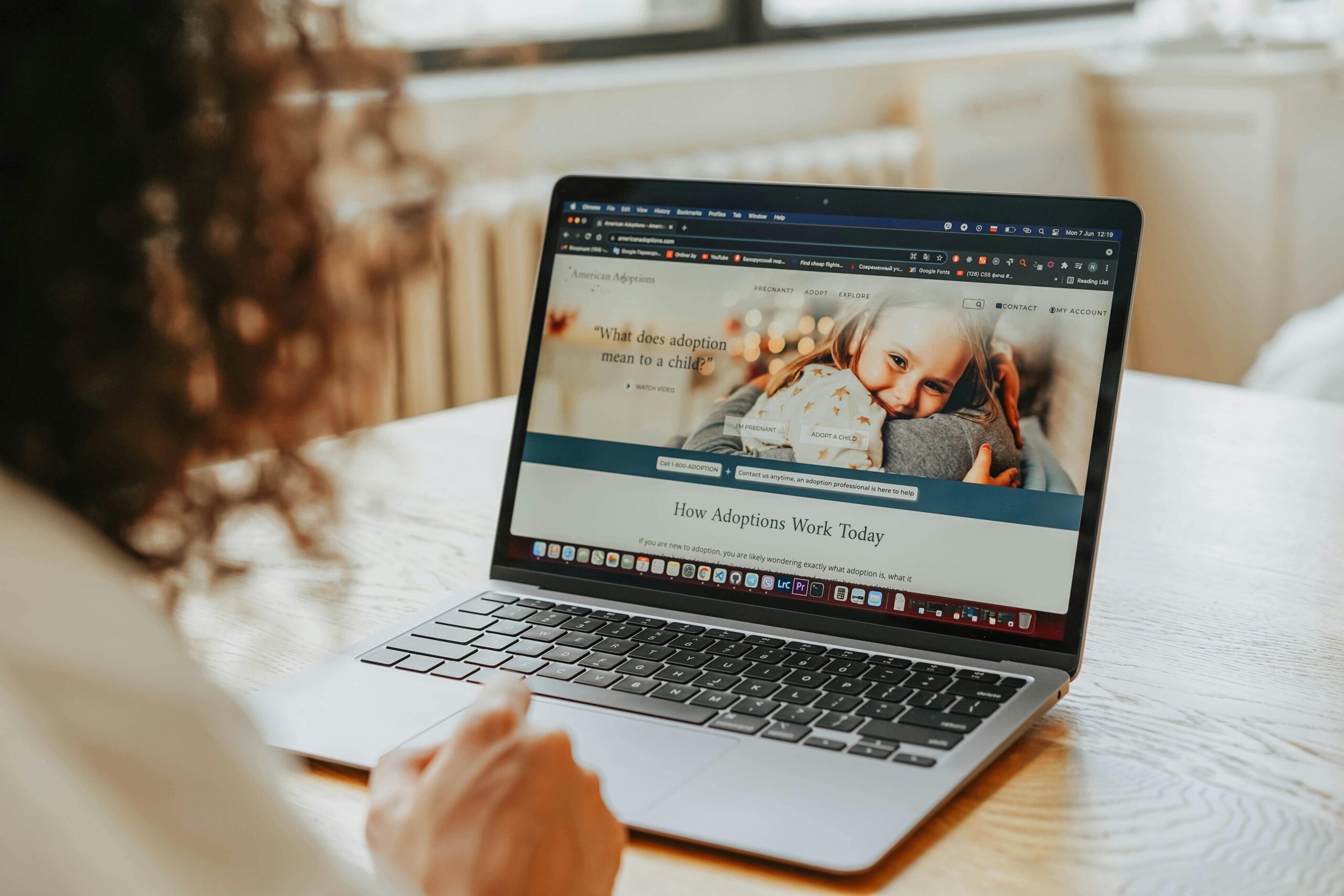
As an example, I’m going to reference a Wellness business:
It’s 10:47 PM on a Tuesday.
A potential client, let’s call her Sarah, is lying in bed, scrolling through her phone. Her neck has been killing her for weeks. She’s tired of the pain, tired of putting it off, and finally ready to do something about it.
She finds your website. Reads your about and services page. Thinks, “Yes, this is exactly what I need.”
She clicks “Book Now.”
And then… nothing happens.
Well, not nothing. A lot happens, actually. She lands on a page with eight different massage options, no clear guidance on which to choose. She clicks one. A form appears asking for her detailed health history before she’s even committed to booking. She scrolls, sees the price isn’t listed anywhere. Clicks back. Tries another service. Gets confused about the difference between “Therapeutic Integration Session” and “Holistic Restoration Treatment.”
By 10:52 PM, Sarah is gone. Not because she didn’t need your help. Not because she couldn’t afford it. But because booking felt harder than the pain she was already in.
And here’s the thing that keeps wellness practitioners up at night: you’ll never know Sarah existed.
She won’t call to complain. She won’t send an email explaining why she didn’t book. She’ll just disappear into the digital void, taking her pain (and her business) to a practitioner whose booking page didn’t make her brain hurt.
If this scenario sounds familiar, you’re not alone. As a website designer who specializes in wellness businesses, I’ve reviewed hundreds of booking flows and discovered something critical: most wellness practitioners are losing 60-80% of potential clients between “I need this” and “Appointment confirmed.”
Not because their services aren’t valuable. Not because their prices are wrong. But because their booking experience, the digital front door to their practice, creates the exact opposite feeling of what their work provides.
You offer calm. Your booking page offers confusion and frustration.
The good news? This is one of the easiest problems to fix on your website. You don’t need a complete redesign or fancy software. You just need to understand what a “calm client journey” actually looks like and how to build one that turns potential visitors into confidently booked clients.
Here’s my 3 quick-wins from my framework that I use with my clients to create booking experiences that feel effortless, trustworthy, and actually help get people to complete the booking.
No overwhelm. Just practical, strategies you can start implementing today.
Let’s bring Sarah back.
Here are 3 Quick Wins You Can Implement Today
In under 30 minutes, these three changes take minimal time but can make an impact.
Quick Win #1: What to do: Go to your main booking page and add a single line of small, light-colored text directly under your “Book Now” button.
Examples:
- “Flexible cancellation with 24-hour notice”
- “You won’t be locked in—this just holds your time”
- “Questions first? Text me: (555) 123-4567”
- “You can reschedule anytime—we get it, life happens”
Why it works: This tiny addition addresses the exact moment of hesitation. People hover over “Book Now” thinking, “but what if I need to cancel?” Your reassurance line answers that before they abandon.
Estimated impact: 10-15% increase in bookings
Quick Win #2: Reduce Your Booking Form to the Essentials
What to do:
Open your booking form/settings
Mark every field as “optional” except: First name, Last name, Email, Phone
Move all other questions to a post-booking intake form
Set up an automated email that sends a detailed intake form after the book
What to include in your post-booking email:
- Detailed health history
- Current medications
- Specific symptoms/goals
- How did you hear about us
- Emergency contact
- Insurance information
- Marketing permissions
Why it works: Every field you remove in your initial booking process increases completion rates by ~11%. By reducing from 12 fields to 4, you’re potentially doubling your booking completion rate. Estimated impact: 30-50% increase in completed bookings.
Quick Win #3: Add a “Not Sure Which Service?” Button
What to do:
On your services overview page or homepage, add a button or link that says:
- “Not sure which service you need?”
- “Let me help you choose.”
- “Feeling overwhelmed? Start here”
Link it to:
- Option A: Simple contact form with one question: “What’s your main concern?”
- Option B: Your text/phone number for quick questions
- Option C: Free 15-minute discovery call booking
Example: [Book a Free 10-Minute Guide Call] ← Links to: HoneyBook/Calendly/booking calendar
Why it works: Uncertain visitors don’t just need information; they need permission to ask for help. This button gives them a path forward when they’re stuck, and feeling “I’m confused, I’ll just leave” into “Let me ask which is right for me.”
Estimated impact: 40-60% increase in overall booking conversion
RELATED POST: Five Showit Features That Make Running a Service-Based Business Website Easier
Why Reducing Decision Fatigue Helps You Get More Bookings
Your potential client is already tired. They’ve been Googling their symptoms for weeks. They’ve read seventeen blog posts about solutions. They’ve compared practitioners. They’ve talked themselves in and out of getting help at least three times.
By the time they land on your website, their decision-making capacity is already depleted.
Then you ask them to make another dozen decisions just to book an appointment.
Which service do they need? What’s the difference between your five massages? Should they book 60 or 90 minutes? Is the “Holistic Integration Session” the same as the “Therapeutic Wellness Treatment”?
Their brain shuts down. They leave.
Decision fatigue is the silent booking killer and the fix is simpler than you think: make the first step completely obvious.
Common Mistakes to Avoid
❌ Too many steps
Don’t make them click “Services” → “Massage” → “Deep Tissue” → “60 min” → “Book”
Combine steps wherever possible
❌ Hidden booking buttons
Don’t bury “Book Now” at the bottom of a long service description
Put CTAs above the fold AND after descriptions
❌ Requiring account creation mid-flow
Don’t interrupt the booking to make them create an account
Create accounts automatically after booking
❌ Asking questions you don’t need yet
Don’t request health history before they’ve committed to booking
Save intake questions for post-booking email
❌ No mobile optimization
Don’t use tiny text or messy layouts
Test your booking flow on an actual phone
❌ Missing the “not sure” escape hatch
Don’t leave uncertain visitors with nowhere to go
Always offer the “Talk to me first” option
Ready to Transform Your Booking Experience?
Now that you’ve just learned a few top tips for creating a conversion-friendly booking experience. The question is: what happens next?
You have three options:
Option 1: DIY Implementation
Take what you’ve learned and implement it yourself.
Option 2: Guided Implementation
You understand what needs to happen, but you want expert guidance to make sure you’re doing it right and not missing anything. Contact me to chat more about it.
Best for: Business owners who want expert direction and implementation help.
Not Ready to Invest? I get it; maybe you’re not ready to hire help yet. That’s completely fine.
Whatever You Choose, Please Don’t Do Nothing.
Here’s what I know after years of designing websites. Your booking set up is either helping you or hurting you. There’s no neutral.
Your future clients… the ones currently hesitating to book, unsure and anxious, are counting on you to make this easier.
Make it easy. Make it work.
Claire Template
Harley Template
About the author: Janelle Cassiano is the founder and designer behind Curated Coastal Lounge, a website design studio based in Carlsbad, CA. She offers strategic Showit website templates and semi-custom website design services on the Showit and Shopify platforms.
Janelle works primarily with health and wellness practices, equestrian businesses, ranches, and agricultural brands that are ready for a website that feels personal, looks polished, and is built to grow with them. Her clients come to her when they want more than a pretty website. They want something that translates their story through clear visual design and strong messaging into a site that earns trust, drives bookings, and converts the right buyers.
View strategic, beautifully designed website templates

Leave a Reply
Read time: 12 min read | If you’ve been researching Shopify themes and landed on Eurus, you’re already looking in the right direction. Built by BSS Commerce and priced at $350, Eurus is one of the most feature-rich, conversion-focused themes on the Shopify Theme Store. One Theme, Two Personalities: Hue vs. Breeze This review focuses […]

Read Time: 5 minutes | This post makes the case for email marketing as a non-negotiable business tool for both e-commerce and service-based brands. Supporting data from the 2026 Omnisend e-commerce Marketing Report is woven in as evidence. The post also includes an email platform comparison and also speaks directly to service-based businesses. Email marketing […]
Read time: 7 minutes | Most businesses focus on what their website says. The more important question is what it communicates before anyone starts reading. Learn how the visual experience of your site shapes trust, credibility, and whether a potential client decides to stay or move on. Every Visual Choice on Your Website Sends a […]
Read time: 5 minutes | This post challenges the common belief that a great product or service sells itself. Using the lens of perception design, hear why the best communicator always wins in today’s online marketplace and what that means for all businesses, including health and wellness practitioners, equestrian and ranch businesses, and product-based brands. […]


Read time: 5 minutes | Professionally designed website templates are one of the smartest investments a small business owner can make. Start with a strong foundation that was built by someone who already figured out the layout, the flow, the placement of testimonials, and the calls to action that actually convert. Preview three niche Curated […]
Read time: 6 minutes | In wellness, your website actually affects how someone feels while they’re on your site. A breakdown of the five Showit website templates for health coaches, nutritionists, chiropractors, functional medicine providers, and holistic practitioners. What to Look for in a Health & Wellness Website Template Before diving into the templates, it’s […]

You may also like...
Disclosure: This page may contain affiliate links and I may receive a small commissions from purchases made through links at no additional cost to you. I only recommend products I would use myself and all opinions expressed here are our own.

")

")

