Read time: 7 minutes. Most businesses focus on what their website says. The more important question is what it communicates before anyone starts reading. Learn how the visual experience of your site shapes trust, credibility, and whether a potential client decides to stay or move on.
Every visual choice on your website sends a signal. The question is whether those signals are working for you or against you.
Research consistently shows that it takes less than three seconds for someone to form a first impression of a website. Less than a minute. Before your headline registers, before your services load, before anyone reads about your process or your experience, the visual experience of your site has already communicated something. The question is not whether your website is making an impression. It is whether that impression matches the quality of the work you actually do.
Before a potential client reads your headline, scans your services, or finds your contact page, something has already registered. The colors. The images. The spacing. The overall feeling of the page. Is this professional or thrown together? Does this feel trustworthy? Does this feel like a business that takes itself seriously?
This post breaks down the specific visual elements that shape how potential clients perceive your business online, what each one is communicating, and what to look for when they are not working the way you intend. Whether you run a service-based business, an e-commerce shop, an equestrian facility, a ranch, or anything in between, these principles apply.
Color and Tone: The Emotional Layer Beneath the Content
Color is one of the most powerful and least understood tools in web design. It communicates before the brain has time to think. Warm neutrals feel grounding and approachable. Cool blues and greens suggest calm and clarity. Deep, saturated tones can feel authoritative or premium depending on context. Bright, high-contrast combinations can feel energizing or, in the wrong setting, overwhelming.
The emotional register of your color palette matters because your visitors are arriving with a question already forming: Is this the right business for me? Color is part of what answers that question before a single word is read.
This does not mean every website needs to be neutral and minimal. It means your color choices should feel intentional and consistent with the experience of working with you. A bold, energetic brand might use a richer, more vibrant palette. A premium service provider might lean toward refined, understated tones that communicate quality and attention to detail. An agricultural or ranch-based business might draw from earthy, grounded colors that feel true to the work. The right palette is the one that accurately previews who you are and what it feels like to work with you.
Font and Typography: The Voice Behind the Words
Fonts have a personality. Serif fonts, the ones with small finishing strokes at the ends of letters, tend to feel established, trustworthy, and grounded. Sans-serif fonts feel clean, modern, and approachable. Script or handwritten fonts feel personal and warm but can be hard to read at scale and can quickly tip into feeling less professional if overused.
The fonts you choose are doing more than displaying your words. They are communicating the tone of your business. A heritage brand using a sleek, minimal sans-serif may be sending a subtly mismatched message. A premium service provider using a casual script for body copy may be sacrificing readability and perceived credibility at the same time.
Typography is not decoration. It is the voice your content speaks in before anyone hears what it actually says.
Most business websites benefit from a pairing of one clean, readable font for headlines and navigation and one complementary font for body copy. The combination creates visual interest without visual noise, and it tends to feel both professional and personable, which is exactly what most businesses are going for.
Common typography mistakes to check for
- Using more than four different fonts across the site. This creates visual inconsistency that reads as disorganized.
- Body copy that is too small to read comfortably on mobile. Most body text should be between 14 and 16 pixels.
- Script fonts are used for long paragraphs or important information, which are difficult to read and often skipped.
- Long, dense blocks of text with no visual breaks. Heavy text feels like work and is frequently abandoned before it is finished.
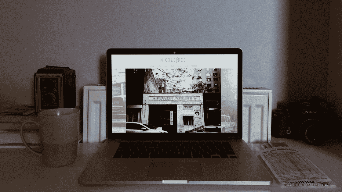
Photography and Imagery: Where Trust Is Earned or Lost
If there is one area where business websites consistently lose potential clients without realizing it, this is it. Photography is the most emotionally immediate element on any page. It is processed faster than color, faster than typography, and far faster than words. And the wrong imagery does not just fail to connect. It actively creates distance.
Only using stock photos signals inauthenticity almost immediately. Mixing premium stock photos and real photos of you, your space, your product, or your work create a completely different response. They make your business feel real, credible, and worth reaching out to.
Here is what is actually happening. Your potential client is trying to answer a very specific question: Can I trust this business with my money, my time, or my project? Generic imagery, no matter how polished, cannot answer that question.
Real photos of your actual product, your real space, the people behind the work, and the process in action give a potential client something genuine to connect with. They signal that there is a real business here, run by real people, doing real work. That signal builds confidence in a way that no library of purchased imagery can replicate.
You do not need a large budget to start. A focused session with a photographer who understands natural light and your space can produce a set of images that genuinely transforms how your website feels. The return on that investment, in credibility, connection, and conversion, is consistently one of the highest a business website can see.
A note on AI-generated imagery
AI-generated images are showing up everywhere, and that is not necessarily a problem. When they are chosen carefully, edited to match your brand, and used alongside genuine photos of your space, your product, or your people, they can fill gaps and add visual interest without undermining credibility. Where businesses run into trouble is when AI imagery becomes a whole replacement for anything real. Visitors are getting better at sensing the artificiality, even when they cannot articulate it, and the effect on trust is the same as over-relying on generic stock. Use AI visuals as a complement to authenticity, not a substitute for it.
White Space and Breathing Room: The Design Element You Cannot See
White space is the empty space on a page. The margins, the gaps between sections, the breathing room around text and images. It is the element most business owners overlook because it feels like nothing is there. It is, in fact, doing some of the most important work on the page.
A crowded page feels overwhelming. Generous white space, clean layouts, and a clear visual hierarchy create a sense of ease and confidence. The design of your site is a preview of your business.
When a page is dense and crowded, the brain reads it as complicated and effortful. There is a low-level cognitive load that activates even before someone starts reading. For a potential client who is comparing options and making a decision about where to invest their time or money, that experience is enough to send them to a competitor. They may not know why. They just know the site felt like too much.
Generous white space creates the opposite effect. It signals that this business is organized, clear, and confident. It makes the content that is present easier to absorb and the overall experience easier to trust. The businesses and brands that consistently earn premium positioning in their markets tend to use space generously and deliberately. The space itself is part of what communicates quality.
Practical ways to add breathing room
- Increase the padding above and below each section of your homepage so content does not feel stacked or rushed.
- Break long paragraphs into shorter ones of two to three sentences each.
- Resist the urge to fill every section of a page. Fewer elements with room to breathe will always outperform a packed page with more information competing for attention.
- Check your mobile layout specifically. Content that feels spacious on a desktop often collapses into a dense, difficult block to read on a phone.
Consistency Across Every Page: The Signal Most Businesses Miss
A potential client lands on your homepage. It feels polished, professional, put together. They click on your services page, and the fonts shift. The colors feel slightly different. The layout has a completely different energy. They click to your contact page and it looks like it came from a different website entirely.
This experience is more common than most realize, and it has a measurable effect on trust. Not a dramatic one. Not one that the visitor can always put into words. But a subtle, accumulating sense of disconnection that quietly erodes the confidence your homepage worked hard to build.
Consistent fonts, colors, and design language across every page tell the visitor that this business is organized, attentive, and professional. Inconsistency does the opposite, even when the content itself is excellent.
Consistency is how your website communicates that you follow through. That the experience of working with you will be as considered and reliable as the experience of exploring your site. That is a signal that matters to every potential client and customer, in every industry, at every price point.
The most common sources of visual inconsistency
- Mixing photos from different sources with different editing styles, lighting conditions, or color temperatures.
- Adding new pages over time without checking that fonts, colors, and spacing match the original site.
- Using different button styles, heading sizes, or link colors across different pages without a clear reason.
A simple fix is to create a brief visual reference for yourself: your exact font names and sizes, your color codes, your button style, and your preferred approach to imagery. Keep it somewhere accessible and check it every time you add or update a page. A few minutes of checking protects the impression your site has worked hard to build.
Putting It All Together: Your Website as a First Impression That Never Sleeps
Your website is working around the clock, introducing your business to people who have never heard of you, and making a case for why you are worth reaching out to. Every hour of every day, someone is landing on your site and forming an opinion. The visual experience of that site is either building the case for you or quietly undermining it.
The color sets the emotional tone. The typography gives your content a voice. The photography shows people what is real. The white space gives them room to think. The consistency tells them what kind of business you run. Altogether, every visual element is either creating the conditions for trust or eroding them.
When you start looking at your website with visual cues in mind, the investment in getting these elements right stops feeling like a design expense and starts feeling like what it actually is: the foundation of every client relationship you will ever have.
Visual Perception Checklist: A Quick Audit for Your Own Site
Work through these questions honestly. They will show you exactly where to focus first.
What to audit on your own site
Color and tone
- When you look at your homepage, does the overall color feel intentional or like it was chosen in a hurry?
- Does your color palette feel aligned with the personality and tone of your business?
- Are you using a consistent, limited set of colors across every page?
- Does the overall visual feel create confidence and ease rather than noise?
- Do your background and text colors create enough contrast to read easily without feeling harsh?
Typography
- Are you using more than three or four colors across the site? If so, the visual experience may feel inconsistent or busy.
- Is your body text large enough to read comfortably on mobile?
- Does your font choice feel consistent with the tone of your brand?
Photography
- Are you using photos that represent your business, your space, your product, or your people?
- Is the lighting warm and natural rather than harsh or flat?
- Do your images have a consistent editing style across the site?
White space
- Does each section of your homepage have enough breathing room?
- Are your paragraphs short enough to be skimmed without effort?
- Does your mobile layout feel open or crowded?
Consistency
- Do your fonts, colors, and spacing match across every page?
- Does your booking, contact, or checkout page feel visually connected to the rest of the site?
- Would a first-time visitor experience your site as one cohesive business or a collection of mismatched parts?
—
Not sure what your website is communicating?
Let’s look at it together. A free discovery call is the best place to start. We will walk through what your site is currently communicating visually and what a more intentional design could do for your business.
Book a Free Call
About the author: Janelle Cassiano is the founder and designer behind Curated Coastal Lounge, a website design studio based in Carlsbad, CA. She offers strategic Showit website templates and semi-custom website design services on the Showit and Shopify platforms.
Janelle works primarily with health and wellness practices, equestrian businesses, ranches, and agricultural brands that are ready for a website that feels personal, looks polished, and is built to grow with them. Her clients come to her when they want more than a pretty website. They want something that translates their story through clear visual design and strong messaging into a site that earns trust, drives bookings, and converts the right buyers.
View my website design services


")

")

